Whittled Down
An Overwhelmingly Thorough Breakdown
Check out the official website here!
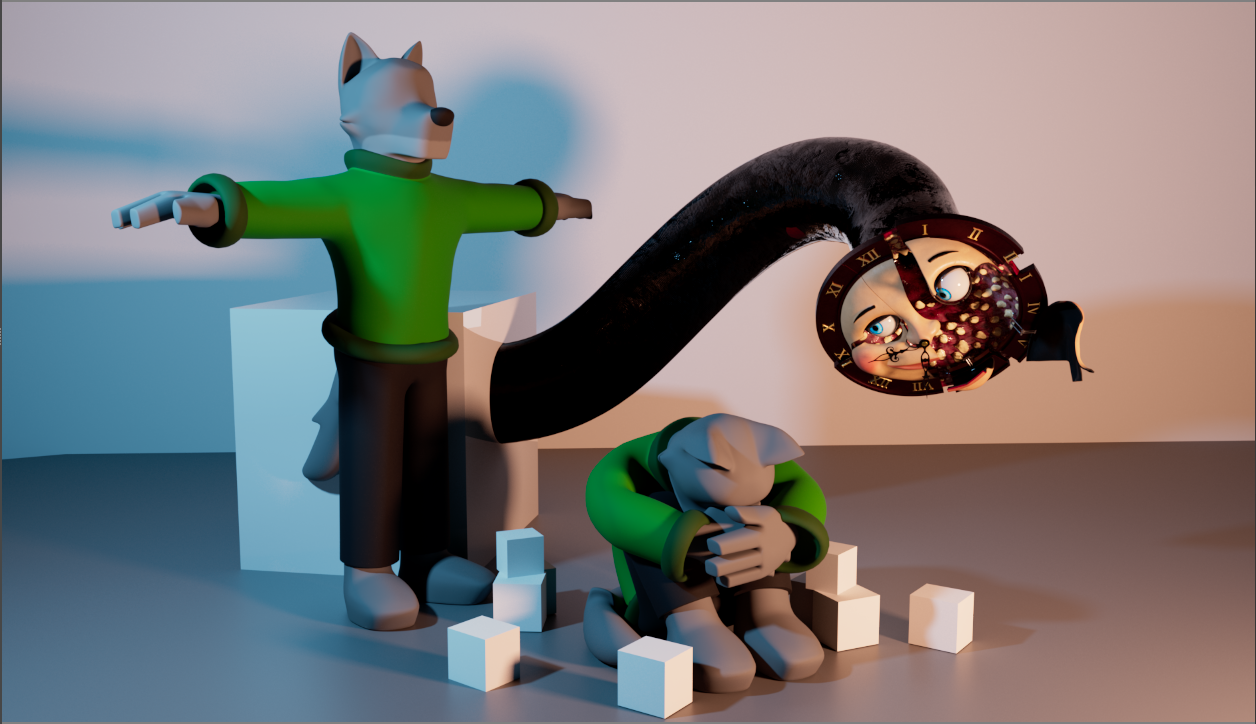
Whittled Down is a mixed 2D/3D horror short about a wolf trapped in a cabin with a clock monster. As time goes on, the stress of his situation weighs on him more and more until he reaches a breaking point. While I had a lot of support from my peers in the form of critique, I produced the film entirely on my own over the course of 16 months. This is by far the most technically intense project I've ever worked on, so I figured it would be useful to have a summary of the entire filmmaking process and the skills I gained from it.
This document is of a length to match the intensity of production. In other words, it's very, very long. My goal here is to provide a complete and in-depth summary of all the work that went into making this film. However, if you're just looking for a quick summary of all the tools I built and technologies I used, I've compiled them at the top.
Table of Contents

Tools And Technologies
| Artistic | |
| Affinity Designer/Publisher | Poster, Press Kit, Promotional Materials. Compare to Adobe Illustrator and InDesign |
| Blender | 3D Sculpting |
| DaVinci Resolve | Editing and Sound Design (Fairlight) |
| FLStudio | Music |
| Krita | Thumbnails, Concept Art |
| Maya | Hard Surface Modelling, Rigging, 3D Animation, Lighting and Rendering (via MtoA) |
| Nuke | Compositing and Color Grading |
| Storyboard Pro | Storyboarding |
| Substance Painter / Designer | Surfacing |
| Toon Boom Harmony | 2D Animation (hand-drawn) |
| Pipeline And Scripting | |
| ACES | Color management |
| Arnold | Rendering |
| Bash/Batch | Shell scripting |
| HTML/CSS/SASS | Promotional website |
| JavaScript | Harmony scripting language |
| MEL | Maya scripting language |
| Python | Krita, Nuke, Maya, and general purpose scripting language |
| Smedge | Render Farm Management |
| Production Management | |
| DJV | Shot review |
| Libreoffice Calc | Spreadsheets for tracking shot list and production schedule (compare to Microsoft Excel) |
| ManicTime | Time tracking |
| Obsidian | Production notes |
| Custom Tools | |
| Directional Displace Gizmo | Nuke gizmo I built to apply a fire flicker effect to the shadows drawn on the 2D animated character |
| Flicker Noise | Nuke script I wrote to control said flicker effect |
| Maya-Style Incremental Saves | Plugins I wrote for Nuke, ToonBoom, and Krita to implement incremental save functionality. This prevented many catastrophic file losses. |
| MtoA TX Typo Fix | Tweak I made to the Maya MtoA plugin program files to fix a bug that broke my rendering pipeline |
| Remote Smedge Submit Script | Maya script I wrote to streamline submitting renders to the render farm I built |
| Toon Boom Tool-Swap | Plugin I wrote for Toon Boom Harmony that adds a few custom hotkeys to made it easier for me to work between Harmony and other drawing apps |
| Variable Rate Function Traversal | Equation I derived and implemented in Maya to help control the procedural animation on the clock monster's mouth |
Production Management
I believe that production is a deeply personal thing, so I tried a lot of different production styles until I found one that worked best for me. I broke my days into segments that I could use to track progress, and split my production schedule into weekly milestones that granted me enough flexibility to shuffle things around when things didn't go to plan (which was always!). I built myself a fancy spreadsheet for managing my tasks and shot list, I tracked my hours using ManicTime, which I thought would be stressful but was actually very useful for giving me a sense of progress, and kept extensive notes to myself in Obsidian. One of my proudest takeaways from this production is my Captain's Log, a journal I kept over the course of production to evaluate what was working, what wasn't working, and what changes I needed to make to my process. By the end of production it was over 50000 words long!
Story Development
When I start to tell a story, the most important thing to me is finding the element at the story's core that makes me want to tell it. Under everything, it's the piece of myself that I want to share with my audience. I call it a kernel, and having one that I care about both ensures that I will stick with the production when times get tough and that my story will be earnest enough to resonate with an audience. The original kernel of Whittled Down was a fear I have of complacency and accidents. I remember when I first learned to drive, it was new and terrifying, and I was very careful because I was acutely aware of the car's capacity to hurt people. After a few months, I got used to driving and it became mundane. I felt safer because the situation was familiar, but it was still just as dangerous as when I started out. That false sense of security terrified me. The initial setup of the wolf trapped in the cabin with the clock was meant to explore how even the most heightened and surreal environments can become dangerously routine. However, about halfway through production I was presenting my most recent draft of the film's storyboards and the class and I came to the conclusion that the current version of the story wasn't working. The pacing was off, it was too energetic, but most importantly there was too much character animation for me to be able to finish the film in any reasonable timeframe. I realized that this story may not actually be the best vehicle for conveying my initial theme, so the story developed in a different direction as I focused more on telling the best story as I could with this premise. I called this part of production the Great Carlisle Massacre of 2022 (after the main character) because I cut and restructured nearly three quarters of the film. Looking back, I am very glad I made that decision, both from a production standpoint and a storytelling one. I always do my best to walk the line between production (is it possible?), mechanical (is it functional?), and thematic (does it have heart?).
One of my favorite things about filmmaking is when story decisions are influenced by production decisions and vice versa; I prefer to view production constraints as challenges rather than chains. To me, the production's impact on the story is just as important as the impact of the characters themselves. I knew from the start that I wanted to produce this film alone, so I limited myself to one environment, one character, and one monster. Working within the constraints of what was possible for me to do as an individual is baked into every fiber of this film's identity, and I find that both exciting and fascinating. In fact, the earliest drafts of the film featured Carlisle knitting instead of whittling, and his ball of yarn was one of the most important props in the film. A big part of the Great Carlisle Massacre was admitting that the technical cost of getting Carlisle to interact with yarn was too great, so I had to find a different repetitive activity to give him. I settled on whittling because it fit well with the atmosphere and I could easily achieve the whittling effect with deformers. In retrospect, the imagery of the wooden figurines fits the film much better than the yarn ever did, and I'm surprised that I didn't make him whittle to begin with! However, my favorite story/production interaction took place when I was modelling the interior of the cabin. I had originally planned to have Carlisle whittle a variety of different wooden animals to put on the mantle. However, by the time I finished modelling the wolf figurine I was behind schedule and needed to move on, so I cut all of the other figurines and just made Carlisle whittle the same wolf figurine over and over again. This introduced a sense of obsessive desperation to his character, and the replication of the same figure over and over became so important to the film's identity that a shot of the mantle overflowing with wolf figurines is the trailer's opening shot!
After the initial concept phase, I view my stories very mechanically. Story issues are problems to be solved in the same way that composing objects in a shot is a problem to be solved. As I develop a story, storytelling becomes more about identifying key moments and figuring out how to guide the audience between them, as well as identifying what information is important so I can make sure that I'm conveying it to my audience. For example, I remember getting into a heated argument with one of my friends about how the film should end. I really wanted to kill the main character, but she was adamant that that ending was too cathartic, and leaving him alive would cause the ending to linger with the audience by denying them a sense of closure. I loved the death sequence I boarded (it was one of my favorite parts of the film!), but she was right--keeping him alive would be impactful in a way that better supported the feeling I wanted to elicit in my audience. I cut my original ending with vigor, boarded a new one where the character breaks down instead of dying, and the film was better off for it. While making cuts can be heart-wrenching, I get a lot of satisfaction from it. I view it as making a sacrifice for the greater good of the story.
Carlisle
Carlisle is the 2D-animated protagonist of Whittled Down. He is defined by his stoicism, which is reflected in his strong brow and sturdy design. I find stoic psychological horror protagonists fascinating because of their perceived ability to endure more psychological torment than the average person. This makes it all the more impactful when they finally break down. If anyone could survive Whittled Down it's Carlisle, but even he can't handle it.

Look Development
I tried to avoid getting too bogged down in concept art because I knew this project was ambitious and I couldn't afford to spend too long in preproduction. My goal with concept work was to create quick sketches that could communicate my ideas to my peers (and myself) clearly without being too detailed. As a result they often turned out rather silly:

However, one aspect of development that I did not skimp on was figuring out the mechanics of the mixed 2D/3D style. I knew from the start I wanted this film to be mixed 2D/3D. I've always been fascinated by mixed media styles, both from an aesthetic standpoint (they look cool!) and from a technical one (it seems hard!). I specifically like mixing 2D characters and 3D environments because I think it plays to the strengths of both mediums. For character work, it is generally faster to draw an expressive character than it is to model and rig one. For environment work, it can be faster to model a single environment and light and render it from different angles instead of needing to paint a new background every time the camera moves.
Mixing 2D and 3D animation is difficult, and it has the potential to completely flop if not done with care. As a result, I took the process of developing the mixed 2D/3D style very seriously. My goal with this film's style was to create a sense of coherence between the 2D-animated Carlisle and his environment so that he looked like he physically existed in the world. At the same time, I wanted to push his stylized 2D-ness as far as I could to create contrast with the environment. This was meant to both add aesthetic interest and create a sense of wrongness, like Carlisle was in a frightening and hostile world that he wasn't supposed to be in. Additionally, I wanted to create contrast between an appealing stylized character and a grotesque realistic monster to push the impact of both designs.
The most important interaction between the 2D and 3D elements of the scene was the lighting. I handled the shadows that Carlisle cast on the 3D environment by creating an invisible 3D model of him that could interact directly with the 3D lighting. I named this model Carliar because he was a fake version of Carlisle, and throughout production I thought of him both as an imposter and a stunt double.
Using a 3D model to handle the 3D shadows allowed the rendering engine to handle Carlisle's shadows in the same way that it handled the shadows of the rest of the environment. This created a stylistic match that made the character feel physically present in the scene.
Figuring out how to light Carlisle was tricky. I wanted to make sure that he had enough volume to feel situated in the scene, but was still flat enough to create contrast. I've compiled some of the initial Carlisle shading tests here. From left to right, top to bottom, the test styles are cel, chalky, flat, gradient, none, and painterly.


For the final look, I opted for a flat, cel-shaded approach. I found that it did an excellent job of evoking volume while also keeping the character unambiguously 2D. Another major benifit of cel shading was that, out of the test styles with distinct shadows, the lack of texture made it the fastest to draw.

The Clock
The main inspiration for the clock comes from the FAO Schwarz clock tower in New York. If you look at the original clock and my concept sketch side-by-side, you can see the resemblance:


Other influences on the design came from leeches and lampreys, as well as the funtime animatronics from the Five Nights at Freddy's franchise. My friends also compared it to Hooty from The Owl House, and while he was not an intentional influence, I find the comparison apt.


Because the clock was so detailed, I almost never drew it accurately. As I mentioned in my look development section, I tried to keep my sketches as simple as possible while still communicating the base idea I was trying to get across. Here is a gallery of some of my favorite production sketches of the clock. Some are more detailed than others.


While most of the modelling for this production was hard surface and handled in Maya, the clock was organic enough that a sculpt/retopo workflow seemed more appropriate. I handled the sculpting in Blender and the retopo in Maya:


Surfacing the clock was a tedious and time consuming process. While the face of the clock was fairly straightforward to handle in Substance Painter, its biological components proved more taxing. The first issue was the teeth. While I was able to use radial symmetry in my sculpt to quickly create over a hundred of them, I had to hand-paint every single one. The material for the body was also a challenge. I wanted to mimic the slimy-drainpipe texture I saw on leeches, but that was nearly impossible for me to paint by hand. I ended up handling it procedurally using Substance Designer.


The last step of getting the clock ready for production was rigging. I love technical work, so I had a great time designing all of the controls to get the Clock to move around.

One of the most interesting challenges was getting the clock's body to pulse and undulate, which was important for making the clock feel alive. Getting the initial movement was not difficult--I just used a noise expression to control certain parts of its body. However, there is a shot near the end of the film where the clock strikes at Carlisle, and its teeth need to start undulating faster as it rears up to attack. I discovered that the equation I was using to model its mouth movements didn't support that use case, so I had to derive a new one:


You can learn more about this process in my writeup on Variable Rate Function Traversal.
The following video is a rig test I made at the end of preproduction to make sure that the clock was working properly. At the time I really liked Crazy Ex Girlfriend, so I thought it would be fun to make it perform the season 2 theme song:
The Cabin
Like everything else in the film, the stripped-down design of the cabin serves both a production purpose and a story purpose. From a production standpoint, the cabin's small size and lack of furniture means fewer assets to make. From a story standpoint, it creates a sense of claustrophobia that is critical for maintaining the film's atmosphere.

My primary goal with the cabin was to make it feel suffocating. Everything is covered in dirt and dust, the fabric on the furniture looks rough and scratchy, and the whole room is lit by a fireplace that gives a feeling of uncomfortable warmth. I also opted for a more detailed art style to enhance the contrast between the 3D environment and the 2D character.

The most interesting challenge of the cabin's design was the fireplace. I knew that even though learning Houdini and making realistic fire would be fun, I was stretched thin enough as it was and could not afford the production overhead of adding effects. After some puzzling, I opted for a stylized paper-cutout effect that both saved me a ton of production time (it only took three hours to put together!) and created a unique aesthetic that I would never have been able to achieve with something more realistic.

In total, I probably only spent around two weeks modelling and surfacing the cabin. That's not necessarily a short amount of time, but in the context of a sixteen month production it's almost terrifyingly small. This was by design: I made the cabin simple so that I could take care of it quickly. However, the fact that the chair I spent an hour modelling got more screentime than the clock that I took two months to create sometimes keeps me up at night.
Storyboarding
Similar to the concept phase, my goal with boards was to get them done as quickly and as clearly as possible so I could make revisions. I'm a staunch believer in not drawing a character's fingers unless they are relevant to a shot. Here are some of my favorite boards (the ones without frames didn't make it into the final version of the film).


This approach worked very well for me--I probably revised the film about sixteen times during production, and each revision saw significant changes. In fact, about a quarter of the way through production I gave a presentation where my class and I decided that the film wasn't working in its current form, so I scrapped nearly the whole thing and furiously reboarded it over winter break (the Great Carlisle Massacre of 2022). The resulting version was better-paced, stronger, and more sensible from a production standpoint. It also had a fun side effect on my shot list: I broke the film into more sequences during the revision, but the existing shots were already numbered, so the sequence order ended up being 1-2-3-5-6-4. I thought it was funny when cuts and revisions showed in my shot list through missing and out-of-order shot numbers. It felt the shots I cut were leaving bloodstains on my production schedule.
Animation
The animation for the 2D character in this film is choppy and involves a lot of long pauses. Because I was animating alone, I needed to work as efficiently as possible, and I didn't have time to draw all the in-betweens that would be necessary for completely smooth animation. This was compounded by the technical complexity of compositing the character into his environment--I'd estimate that each key in this film took at least two hours to go from sketch to final. However, from an aesthetic standpoint, the choppy animation created two effects that were essential to the look of the film. First, the long still shots were vital to the film's pacing and atmosphere. The film was meant to be a subtle, slow burn, and the stillness of the shots both reflected the main character's stoic nature and the film's overall quietness. Second, the choppiness of the animation on Carlisle enhanced the contrast between him and the 3D environment. While Carlisle generally moved on twos and threes with very long holds, the 3D elements in the scene moved exclusively on ones. The sole exception to this rule was when Carlisle was holding a 3D prop--in that case, the prop would move to match his animation. This 2D/3D animation contrast is most evident in the clock attack scene--the clock moves with uncanny smoothness, while Carlisle moves with the choppiness that we have grown accustomed to over the course of the film. However, the constant smooth flickering of the fire sets up the 2D and 3D elements' duelling animation timings from the very first shot. Even if I had the resources to smooth out Carlisle's character animation, I wouldn't. I view his character animation as core to the film's look and personality.
Because I had so few drawings to work with, I was very intentional about the timing of my keys. I varied my timing as much as possible to squeeze every ounce of expression out of my limited frames. I'm a musician, and so I like to tap out the rhythm of my keys as if it's a syncopated beat. This quirk led me to realize that if I turned my keys into sheet music, a lot of my character animation would loosely follow this pattern:


I like to listen to music as I work to keep me motivated, but I had to pause it while I was animating because it would start influencing the rhythm of my shots!
Lighting
The 3D lighting of this film was actually fairly straightforward, and most of the issues with getting 2D and 3D styles to play nice together are already addressed in the Look Development and Compositing sections.
The key balancing act of lighting Whittled Down was keeping everything dark, but not too dark. The heavy shadows and dark corners of the cabin were important for preserving a sense of suffocating claustrophobia, but there is nothing more frustrating to an audience than not being able to see what's happening in a scene. I did my best to err on the side of making things a little too bright, and relied on other techniques to make the scene feel darker than it actually was. For example, the darkness of the textures in the environment helped to create the aesthetic of darkness without needing to overly darken the lighting of the scene itself. The walls and floor of the cabin are covered in dust and dirt, and the area around the fireplace is black with soot. Even under bright lighting conditions, these surfaces would still look dark, so they help to preserve the dark feeling of the cabin under any lighting condition.
The primary light source of the cabin was the fireplace, which posed two challenges. The first was the flickering effect. Because this film involves a lot of long pauses, the constantly flickering light source is critical for keeping otherwise static shots interesting. I ended up achieving the effect I wanted by creating a group of point lights that swarmed around the inside of the fireplace like fireflies.

However, I quickly ran into another issue. Since the light was coming from inside the fireplace, the entire back wall of the cabin was dark. This completely undermined the suffocating warmth I was trying to achieve with the firelight. The contrast between the warm and cool colors made the fireplace feel safe and warm, but I wanted the entire scene to be saturated with warm colors to create a sense of stuffy suffocation. I used area lights to create additional light swarms around the cabin to fill in the gaps. I think this was a good example of the necessary balance between realism and mood. While this lighting setup wasn't physically accurate, it was still close enough to reality to not feel obviously wrong, and it communicated a critical element of the scene's atmosphere.


Here's an example of what my full lighting process looked like:
Rendering Pipeline
Rendering any 3D animated scene takes a lot of resources, and that's doubly true for environments as detailed as the one in Whittled Down. While my scene is simpler than something than you might find in a bigger production, it was still heavy enough for each frame to take about an hour to render.
In order to render this film in a reasonable amount of time, I put together my own render farm by conscripting my roommate and I's computers into a little network. I had a lot of fun setting all of it up. One important aspect of keeping track of a network is giving the devices names so that you can tell which one is which, so I gave the computers names like Juliet and Esther. Any time we weren't using our computers for class, I would connect them to the network drive and set them to work. There was a three-month period in our household when I was kicking off renders nearly constantly, and the sound of computer fans became a familiar part of the apartment's ambiance. I remember the ambient temperature of my bedroom was about three degrees warmer than the rest of the apartment because my computer acted like a space heater.
I decided to use Smedge to manage the render farm because of its simplicity. While that did end up causing problems later in production (it was more difficult for me to dig into it to solve networking problems), the overall ease of setup offset that cost.
I had a lot of fun optimizing my render pipeline to make it as easy as possible for me to submit and evaluate shots. The most important tool I built was my Remote Smedge Submit Script, which allowed me to send a shot to the render farm with the click of a button. I also ended up finding a bug in the plugin that Maya uses to talk to the Arnold renderer, which broke part of my rendering pipeline. I remember frantically digging through Maya's program files trying to find the issue, which turned out to be a one character typo in a configuration file.
Compositing
Compositing was the most technically intense part of production by a long shot. Getting 2D and 3D animation to look good together is no easy task, and compositing was the step where I had to pull it all together.
One of the reasons compositing was so time-consuming was that, because it was the first time I was seeing the 2D and 3D elements of the scene together, it was the part of production where any issues in the lighting and character animation would rear their ugly heads. This meant that in addition to working in Nuke, I was also constantly switching into Harmony and Maya to fix 2D and 3D issues respectively. I often had all three applications open at the same time. My computer was not happy with me.
However, the toughest part of compositing was drawing the highlights and shadows on Carlisle. I remember talking to someone who assumed I used some sort of shader to handle Carlisle's lighting, and when he asked me what tool I used to create the effect, I just responded "a pencil". I found it easiest to draw the highlights and shadows in Harmony since Harmony's drawing tools were more robust than Nuke's. However, that meant I had to split off the ink/paint/highlight/shadow passes into their own layers to transfer them from Harmony into Nuke. When combined with the fact that I also split Carlisle's body across different layers to make it easier to create holds, I often ended up with twenty or more Carlisle layers coming out of Harmony that I then had to layer back together in Nuke. This led to some rather complex compositing setups. The node network below is the Nuke script for the opening shot of the film, which was one of the most technically complex shots from a compositing standpoint. You can see that Carlisle completely dominates the node network.

From an artistic standpoint, figuring out how to translate soft 3D lighting into hard cel shading was difficult. I couldn't just trace along the reference model for two reasons. First, my shading style for Carlisle only allowed for highlight, shadow, and neutral tones, which meant I had to be selective about the lighting information that I chose to translate over to Carlisle. Second, I had to be aware of the composition of the negative space that Carlisle's shadows carved out. Deciding on Carlisle's shading actually involved many artistic decisions regarding how to best represent his form and integrate him into the environment while preserving a strong composition. Here's an example of the sorts of tests I would do to try to figure out the most effective shading on a pose. Usually I would go through this process for one or two key frames in a shot, then work outwards.

However, the most challenging compositing issue was figuring out how to get Carlisle's highlights and shadows to flicker in the firelight. I knew that they had to move in order to keep Carlisle feeling dynamic during holds, but I did not have time to draw all of the flickering by hand. I tried tons of different solutions, some in Harmony and some in Nuke, before I finally came to the conclusion that the only way to get the effect I was looking for was to build a tool myself. I designed a gizmo for nuke called the Directional Displace Gizmo that allowed me to use color to specify what direction the shadows should move in, then wiggle them back and forth. It still took hours to build the displacement maps, but that was just a drop in the ocean of how long it would have taken to draw the movement by hand.
Next game the render corrections. The shots in this film took long enough to re-render that I had to try to fix as many issues as I possibly could in post. I actually made a game out of it--every time I re-rendered a shot, I would draw a dead Carlisle on an index card and post it on the wall under a big sign that said "EVERY TIME YOU RE-RENDER A SHOT, ANOTHER CARLISLE DIES!" By the end of production I ended up with over seventy of them. Most of this comes down to the fact that I used Arnold GPU rendering, which didn't support any AOVs other than the beauty pass. I did separate CPU renders to at least get depth and cryptomatte passes (which were fairly cheap if I turned off all the lights), but it still didn't give me much to work with. I described my situation to a friend as "fighting for my life with a beauty pass, a depth pass, and a cryptomatte". I fixed most of my problems by either getting clever with masks and rotos, or re-rendering tiny patches of scenes and applying them over shots like band-aids. Unfortunately, each of those band-aids killed another Carlisle.
One of the most common errors I ran into was when the 3D model and 2D drawing of Carlisle didn't match up perfectly, which created issues with contact shadows. In many cases this was unavoidable--Carlisle is a 2D character, and he shouldn't be able to perfectly translate into 3D. However, this meant I had to go and clean up many of the shadows in post.
The most aggressive shadow correction in the film happens near the beginning when Carlisle is holding a turnip. Because the 3D model's hand clips through the turnip, it creates a harsh black area, and because Carlisle's hand doesn't perfectly match the 3D model of his hand, that black area isn't covered. It also means that the contact shadow is in the wrong place. The following images illustrate the correction process. The first is the low-quality render of the 3D model that I used for lighting reference, and the second is the high-quality render that I used for the final comp. The third picture is the shot before I made corrections on the turnip, and the last one is the final result.


The last piece of the puzzle was color grading, which I'm lumping in with compositing because I handled both tasks together in Nuke. I joked with my friends that color grading work was the quickest ticket to a psychotic break because looking at the subtle differences between graded and ungraded shots and trying to decide which version was better made me feel like I was losing my grip on reality. However, like every other step of the pipeline, I eventually fell into a rhythm with it and had a really good time. I remember sending one of my friends a picture of what my color grading workspace looked like. He said that it looked like I was piloting a submarine:

My favorite piece of grading work in the film was a shot where Carlisle was facing away from the camera and whittling a block of wood. In the original render, the chair in the foreground was very dim and almost purple, but in the grading pass I pushed its reds to a more saturated color that made the chair stand out as an important set piece while also complementing the green of Carlisle's sweater.


I appreciated compositing because, out of all the parts of production, it felt the most like I was doing something new. The problems I ran into were generally very specific to the needs of my project, so there were no guides or tutorials for fixing them. I felt like an explorer hacking into new territory and discovering things on my own.
Sound Design
Sound design was probably the most difficult part of production for me. Out of all the pieces of the production pipeline, sound was the one I was least experienced in, so I had very little confidence in my taste. In other words, I wasn't confident that I had enough experience to be able to hear the subtle differences that separate a good sound from a bad one. As a result, I approached the sound design for this film very carefully.
I wanted the sound design of this film to be quiet and minimalist, with a focus on native sound. The story and animation are both quiet and subtle, and the sound needed to match. For example, the film has almost no score except for a very intense sting that plays when the clock attacks. This made all of the foley in the film very important--I had no score to rely on to fill in gaps in the soundscape, so all of the subtle noises had to be strong.
In order to make sure I could get the exact sound effects I wanted, I recorded nearly all of the foley myself. I set up a makeshift recording booth using my bedsheets and spent hours with my legs contorted to fit into the tiny space while I rubbed scarves together and banged wooden blocks into each other.
There were three elements of this film's sound design that were particularly challenging. The first was the clock chime sound. I spent hours listening to hundreds of clock chimes in order to find the right one, but all of them were too high or too tinny or had too much background noise or just otherwise didn't work. Even now, the clock chime is one of the only things about the film that I'm not satisfied with, but eventually I had to cut my losses and accept that even though the chime wasn't perfect, it was still good enough.
The other two challenges were the the clock creature sounds and the score. Creature sound design is difficult because it requires you to create noises that sound plausible, but at the same time don't sound like they belong to any known animal or item. This means that you need to layer together many sounds to create something distinct, but also make them all act as one. Creating that sense of cohesion is not easy, and requires a lot of trial and error.
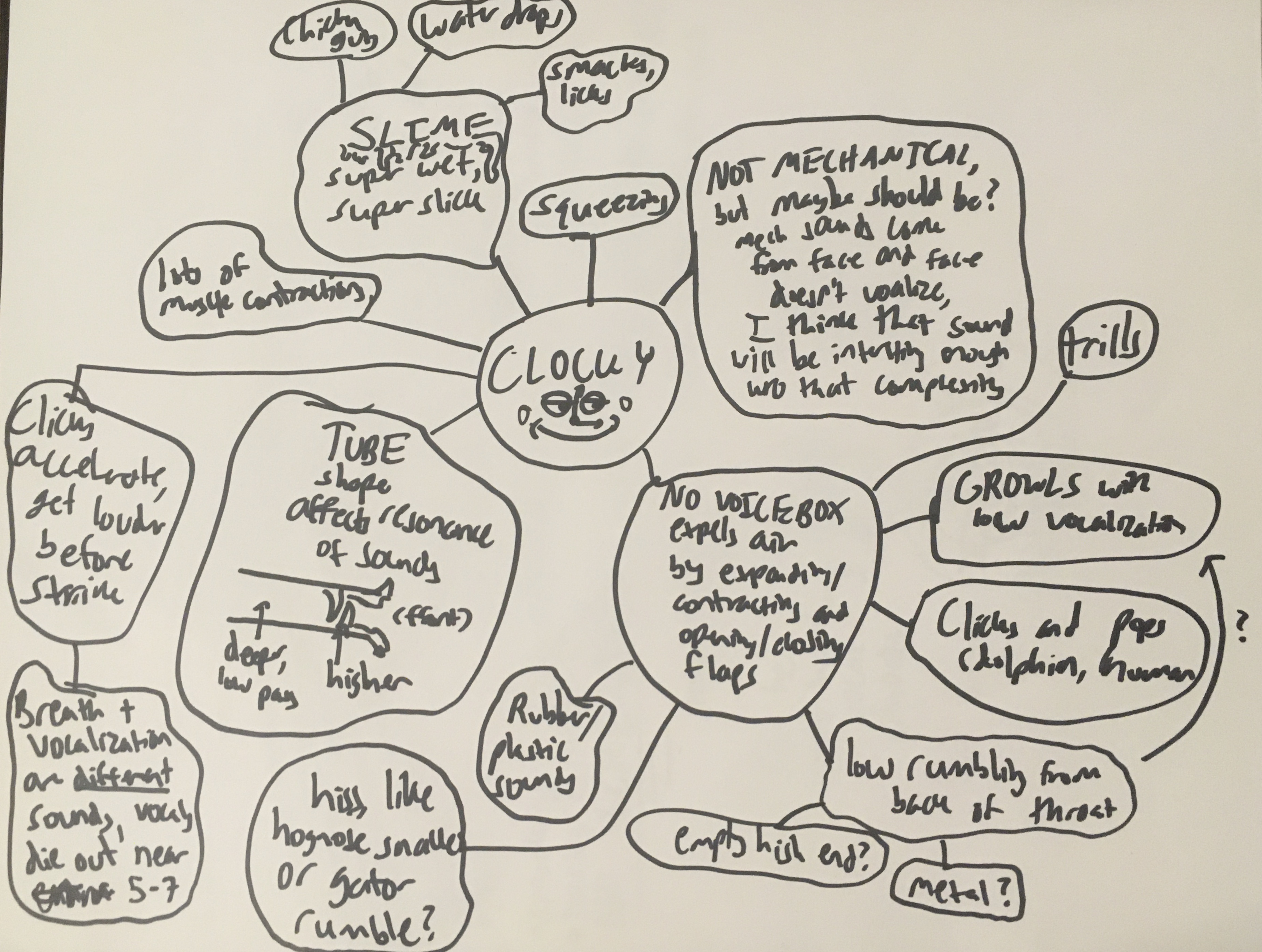
I approached the sound design for the clock by thinking about where the sounds would come from physically. I knew that its face would make mechanical noises as its metal parts moved, and I imagined that it vocalized by opening and closing the flaps deep in its throat to create clicking and popping sounds. I ended up making some very chaotic mind maps to keep everything straight:


After many hours of building up and tearing down soundscapes, I finally arrived at my final design.

The score presented a similar issue. While I've written music before, the screeching, chaotic dissonance of this film's score made it unlike anything I've ever composed. In fact, I found the process of layering sounds together in a violent and unsettling composition to be much more similar to the process of designing the creature sounds than any music I've ever written. Many of the sounds in the score didn't even come from instruments--the violin-like screeching noise at the very front of the score is actually the sound of dry ice evaporating.
I approached mixing with the lightest touch possible. I'm always wary of situations where I feel obligated to make changes for the sake of making changes, so I did my best to keep everything simple. The main effects I applied were panning and reverb to create a stronger sense of space, but even those effects were very subtle. For a stripped-back soundscape like the one in Whittled Down, it was important for me to have confidence in the minimal design, allow it to speak for itself, and not fear quiet pauses.
Parting Thoughts
If you want to get better at animation, solo producing a short film is a great way to do it. Creating Whittled Down honed my animation production skills like no other project has in my life. While I had touched most parts of the pipeline before, Whittled Down was my first time doing any of these things for a production this large. Throwing myself to the sharks like this forced me to learn a lot and learn it quickly, and that's exactly what I did.
Making a short film is also a great way to find out what you like, what you're good at, and what you want to do. I've always been the sort of person that likes doing everything, so when I decided to pursue a career in animation I was racked with indecision about where I could fit into the pipeline. I actually wasn't even planning on going into animation before I started work on Whittled Down--I was dead-set on software engineering! Unfortunately for my decision-making ability, working on Whittled Down reaffirmed that I actually do love every step of the production process. From compositing to storyboarding to sound design, I find every craft that goes into animation beautiful and fulfilling in its own way. However, production also revealed to me a passion for technical direction that I wouldn't have discovered otherwise. No matter what part of the pipeline I was in, I was always building little tools to help myself work more effectively. I even built some bigger tools like the Directional Displace Gizmo that I used to achieve looks that wouldn't have been possible otherwise. Before Whittled Down I was terrified of specialization. After Whittled Down I've discovered that I really really really like technical direction.
However, the most meaningful thing to me after all of this is being able to look at Whittled Down and not only see my fingerprints all over it, but the fingerprints of my friends as well. Working alone was lonely. I would sometimes go for days at a time without seeing anyone, and at certain points working on Whittled Down made me feel like a psychological horror protagonist myself. But when I look at the finished product, I see traces of my friends' influences everywhere. I look at shot 2-2's contact shadows and remember how one of my friends was the person who pointed out that I needed to revise them. I look at the clock creature's irises and remember one of my friends showing me a technique I could use to paint them. I look at the entire structure of the story itself and remember that, at its most fundamental level, Whittled Down would not be the film it is today without the critique of my peers. Even though I produced the film alone, I wasn't really alone. I had people standing by me, supporting me, and pushing me to take everything just a little bit further the whole way through.
Working on Whittled Down was one of the most intense and rewarding experiences of my entire life, and I'm so excited to finally get the chance to share it with the world. Animation is hard and it takes a long time, but I wouldn't do it if I didn't love it, and if it was easy it wouldn't be fun!
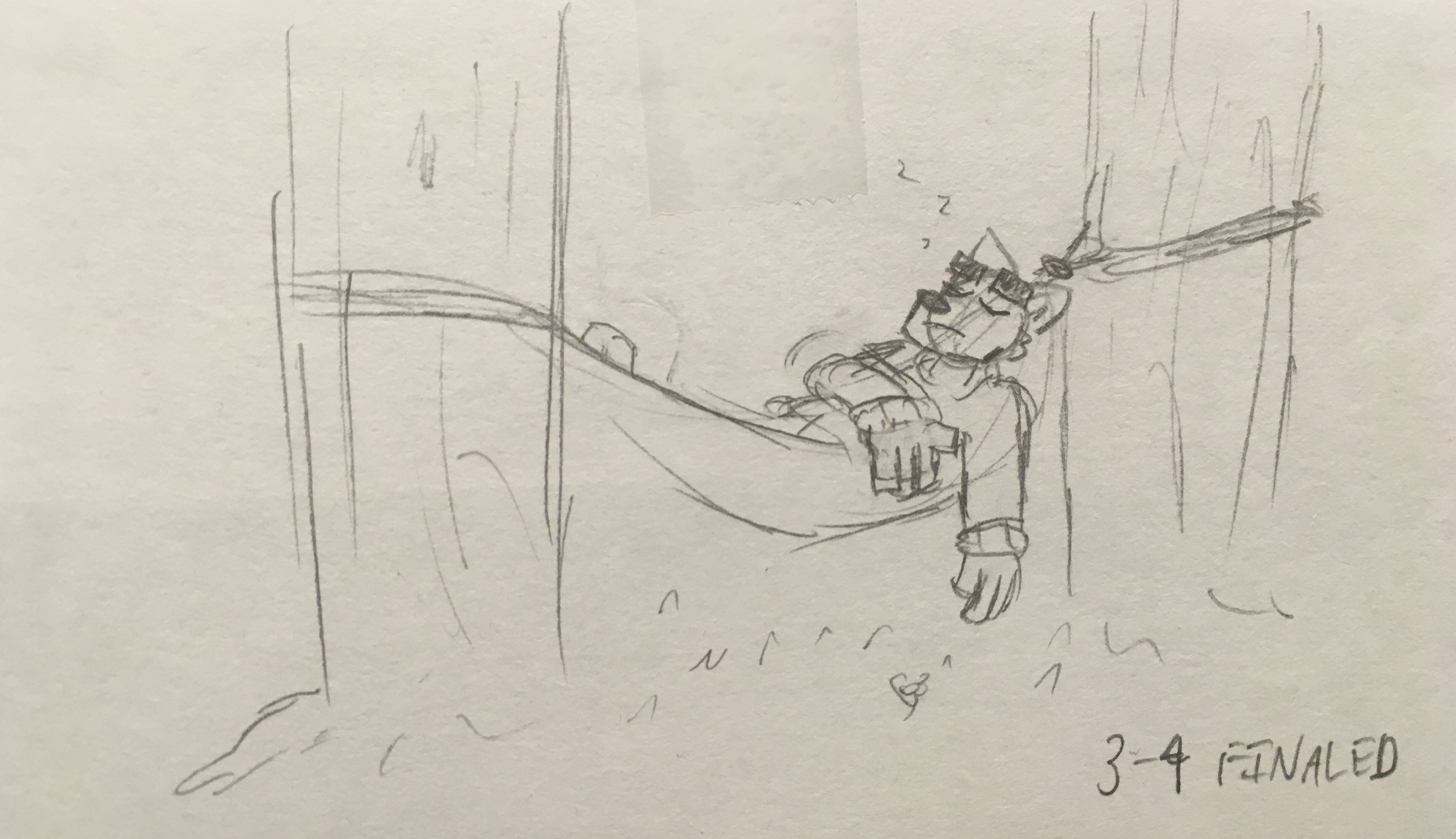
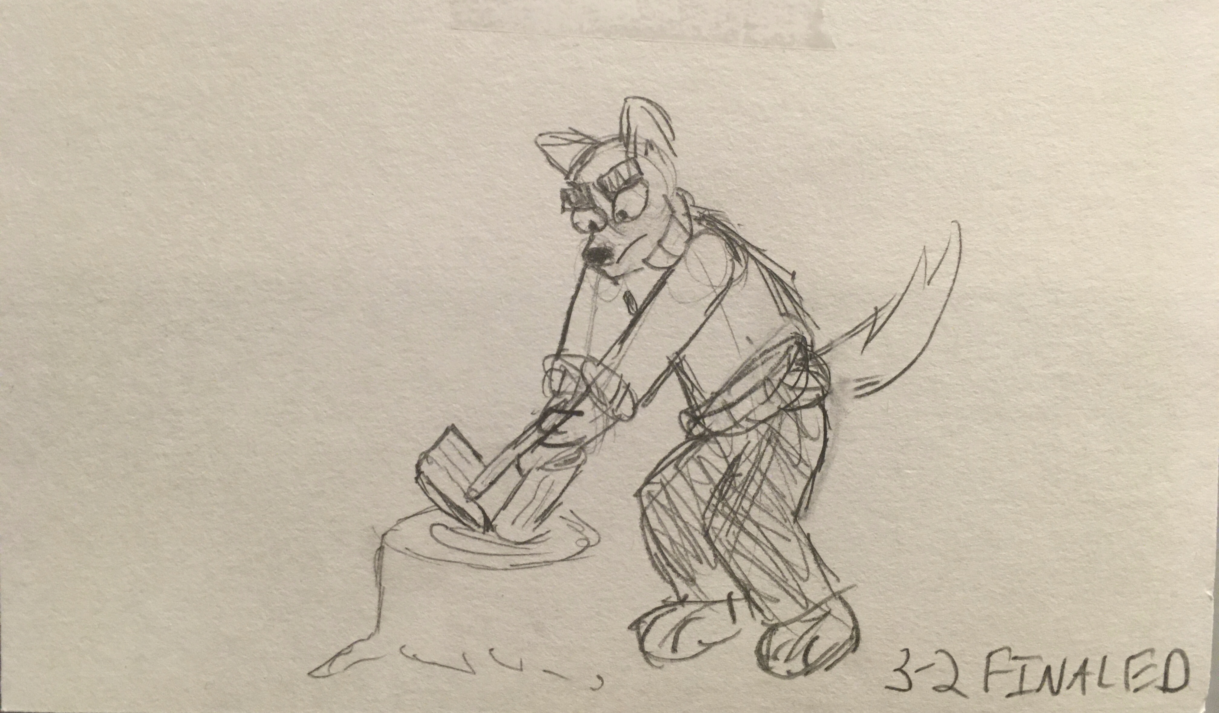
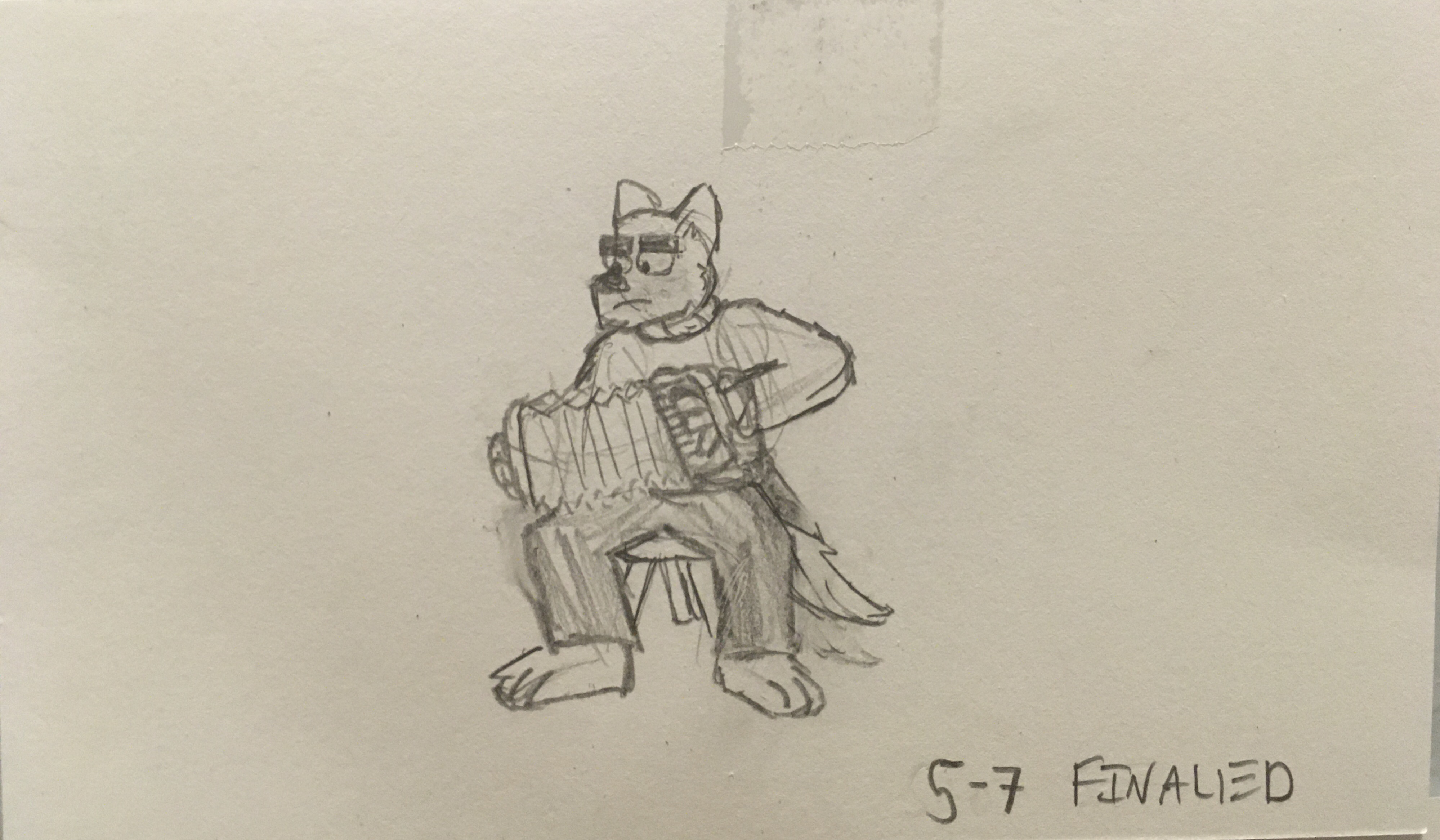
As a nice note to end on, every time I approved a shot for the final cut I drew a small sketch of Carlisle living the life that I imagine he would be living if not for the events of the film. I found it bittersweet to see him finally get a chance to be happy. Here's a small collection of my favorites.